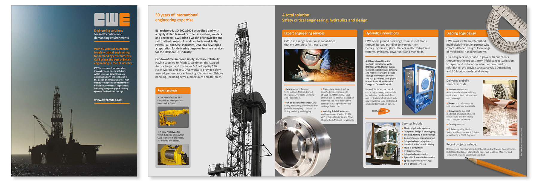
Brochure designed to appeal to the American market, with an emphasis on CWE’s work in the oil industry.
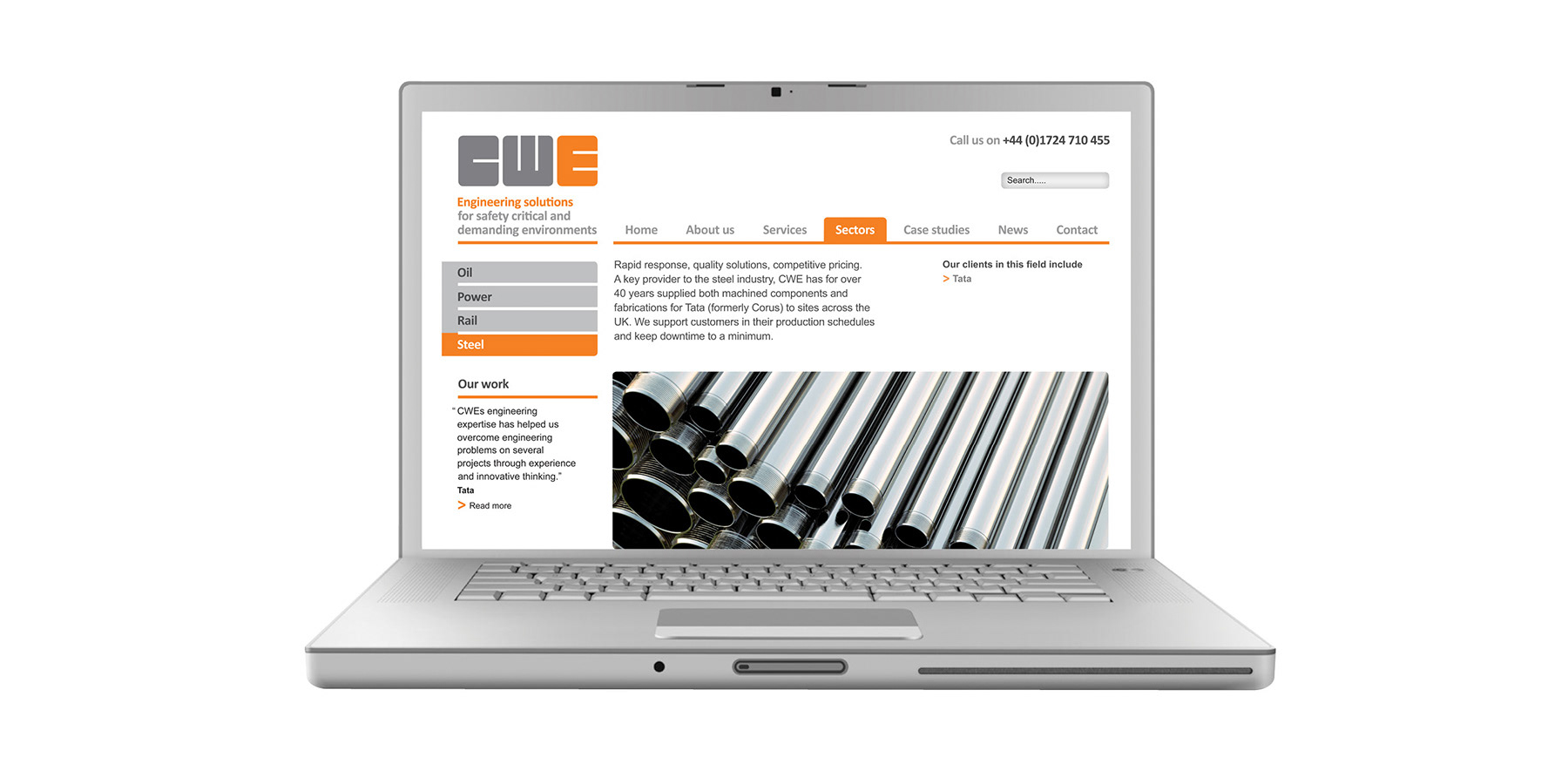
Rebrand of this successful engineering company. The logo forms a heavy, stable and industrial mark, indicative of the industry it represents. The new website and marketing materials enforce the identity, demonstrating a bold use of colour combined with clear layout and photography.
Brochure designed to appeal to the American market, with an emphasis on CWE’s work in the oil industry.